SmartLife app

Responsibilities: Product | UX Design

In this case study, I'll showcase my smart home app design project. My goal was to create an intuitive app for seamless control of smart devices. "SmartLife" is a cutting-edge platform that integrates technology and elegant design, empowering users to manage lighting, security, and more in one place. Through a user-centered approach, I aimed to simplify device management within a single, intuitive interface.
Challenge

With the rapid growth of innovative home technology, there is an increasing demand for efficient and user-centric interfaces that simplify the management of connected devices. Homeowners are seeking solutions that offer convenience, energy efficiency, and enhanced security.

Design Process

  1. Research & Analysis: To gain a deep understanding of the target audience's needs and preferences, I conducted user surveys. This method helped me gather valuable insights into their pain points, expectations, and experiences with existing smart home apps. Additionally, I conducted a thorough competitive analysis to understand the strengths and weaknesses of similar apps in the market. Link to survey

    Key Findings:

    Through user research, I discovered that the most common pain points experienced by homeowners included complex device setup processes, fragmented control interfaces, and a lack of personalized automation options. Additionally, users expressed a desire for a visually appealing and intuitive app that could seamlessly integrate with various smart home devices.

80%

80%

Complex device setup processes
80% of respondents found the setup process for smart home devices to be challenging or complex.

60%

60%

Fragmented control interfaces:
60% of respondents mentioned difficulties in managing multiple smart home devices from different brands or platforms due to fragmented control interfaces.

70%

70%

Lack of personalized automation options
70% of respondents expressed a desire for more customization and personalization options when it comes to automating their smart home devices.

90%

90%

Visually appealing and intuitive app
90% of respondents emphasized the importance of a visually appealing and intuitive app design for managing their smart home devices effectively.

80%

80%

Seamless integration with various smart home devices
80% of respondents stated a need for a smart home app that could seamlessly integrate and control a wide range of smart home devices from different manufacturers.

80%

Complex device setup processes
80% of respondents found the setup process for smart home devices to be challenging or complex.

60%

Fragmented control interfaces:
60% of respondents mentioned difficulties in managing multiple smart home devices from different brands or platforms due to fragmented control interfaces.

70%

Lack of personalized automation options
70% of respondents expressed a desire for more customization and personalization options when it comes to automating their smart home devices.

90%

Visually appealing and intuitive app
90% of respondents emphasized the importance of a visually appealing and intuitive app design for managing their smart home devices effectively.

80%

Seamless integration with various smart home devices
80% of respondents stated a need for a smart home app that could seamlessly integrate and control a wide range of smart home devices from different manufacturers.

  1. Information Architecture: Based on the research findings, I made significant changes to the initial project direction. I shifted the focus towards streamlining the setup process, creating a unified interface for device control, and implementing intelligent automation features. These changes ensured that the app addressed the identified pain points and catered to the target audience's expectations. The main problem I aimed to address with the smart home app was the lack of a user-friendly and cohesive interface for managing smart home devices. Homeowners often struggle with complex setups, scattered control interfaces, and a lack of personalized automation options. The goal was to create a solution that simplifies the user experience, enhances control capabilities, and provides personalized automation features. To create a coherent structure for the app, I developed an information architecture that grouped related features and content. This hierarchy ensured logical navigation and easy access to key functionalities. The goal was to provide users with a clear and intuitive path to control their devices and access additional settings.


  1. Wireframing & Prototyping: Using wireframing tools, I translated the finalized information architecture into low-fidelity representations of the app's interface. The wireframes focused on the layout, functionality, and interaction design of key screens and features. This allowed me to quickly iterate and gather feedback before investing significant resources into visual design.


  1. Usability Testing: To validate the design and gather user feedback, I conducted usability testing sessions with representative users. These sessions involved tasks and scenarios that allowed users to interact with the app and provide insights into its usability, efficiency, and overall satisfaction.


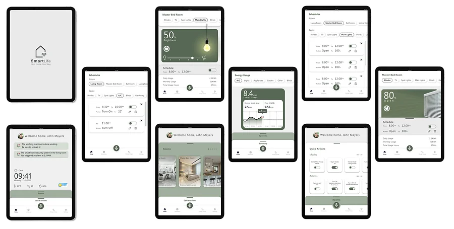
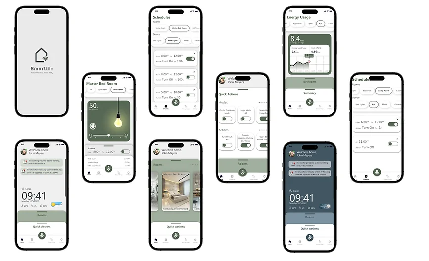
  2. Visual Design & Style Guide: The visual design aimed to create an aesthetically pleasing and cohesive interface. I established a visual style guide that included color palettes, typography choices, iconography, and imagery guidelines. The design principles focused on simplicity, consistency, and visual hierarchy to enhance the user experience. Based on the style guide, I created high-fidelity visual design mockups that showcased the app's interface with the finalized visual elements. This included screen mockups with polished colors, typography, icons, and imagery, giving stakeholders and users a realistic preview of the app's visual aesthetic.


Tablet Screens

Mobile Screens

Tablet Screens

Mobile Screens

Conclusion

In conclusion, the smart home app design project aimed to address the need for a user-friendly and cohesive interface for managing smart home devices. By conducting thorough research, ideation, and iterative design processes, I successfully created a solution that simplifies device setup, provides a unified control interface, and offers personalized automation features.

Ready to Elevate Your Project?

Let's bring your design vision to life.

© Omer Ben Eliahu 2023

Ready to Elevate Your Project?

Let's bring your design vision to life.

© Omer Ben Eliahu 2023