CookUp app
Responsibilities: Product | UX Design
In this case study, I will present a comprehensive overview of my smart home app design project. The primary objective of the project was to create a user-friendly and intuitive mobile application that allows homeowners to seamlessly control and manage their smart home devices.

Challenge
In today's fast-paced world, people are increasingly turning to digital solutions for their cooking needs. However, many existing recipe and cooking apps present challenges and pain points for users. This project aimed to address those issues and provide a user-centric app that would simplify the cooking experience.
Design Process
Research & Analysis: The recipe app tackles cooking challenges by addressing disorganized recipes, limited discovery, and complex meal planning. User research uncovered struggles with inefficient searches, unorganized planning, and lack of personalization, hindering exploring new dishes and efficient meal preparation. To gain a deeper understanding of the target audience and their needs, I employed a mixed-method research approach. This included conducting user interviews and competitive analysis. Link to survey
Key Findings:
Through user research, I discovered that the most common pain points experienced by cooking enthusiasts included difficulty in finding and organizing recipes, fragmented access to recipe collections across multiple platforms, and a lack of personalized meal-planning options. Additionally, users expressed a desire for a visually appealing and intuitive app that could seamlessly integrate with their cooking routines and provide personalized recommendations based on their dietary preferences and restrictions.
75%
Difficulty in finding and organizing recipes
75% of participants expressed frustration in finding specific recipes that meet their needs and preferences. They highlighted the challenge of sifting through vast recipe collections online and the lack of effective search filters to narrow down results.
80%
Fragmented access to recipe collections 80% of participants mentioned that they often use multiple platforms, such as websites, apps, and physical recipe cards, to access their recipe collections. This resulted in a fragmented experience, with recipes scattered across various platforms, making it difficult to have a centralized and organized collection.
70%
Lack of personalized meal planning options
70% of participants expressed a desire for personalized meal planning features. They emphasized the importance of having the ability to set dietary preferences, such as vegetarian, gluten-free, or dairy-free, and receiving tailored recipe recommendations based on their specific needs.
90%
Visual appeal and intuitive interface
90% of participants emphasized the importance of a visually appealing app design. They desired a clean and modern interface with attractive food imagery that would enhance the overall cooking experience.
80%
Seamless integration with cooking routines
85% of participants expressed the need for the CookUp! app to seamlessly integrate with their existing cooking routines. This includes features such as timers, step-by-step cooking instructions, and the ability to adjust serving sizes or convert units of measurement within the app. Participants highlighted the importance of a cohesive and efficient cooking process.
Usability Testing: To validate the design and gather user feedback, I conducted usability testing sessions with representative users. These sessions involved tasks and scenarios that allowed users to interact with the app and provide insights into its usability, efficiency, and overall satisfaction.
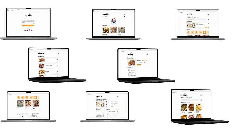
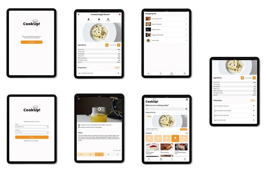
Visual Design & Style Guide: The visual design for the CookUp! app aimed to create a delightful and visually appealing interface that enhances the cooking experience. The design principles focused on simplicity, consistency, and a warm, inviting aesthetic. I established a style guide that included color palettes, typography choices, iconography, and imagery guidelines to maintain a cohesive visual identity. Based on the style guide, I created high-fidelity visual design mockups that showcased the app's interface with the finalized visual elements. These mockups included screens with carefully chosen colors, typography, icons, and imagery that reflect the culinary theme and create an engaging atmosphere for users.
Information Architecture: These user personas influenced the design decisions by helping prioritize features such as personalized recipe recommendations, efficient grocery list management, and robust search functionality. The user journey mapping process involved identifying the typical workflows and touchpoints related to using a recipe and cooking app. This helped to understand where users faced pain points and areas where their needs may not be adequately addressed.
Creating personas is a way to imagine who I would be designing the app for
Wireframing & Prototyping: I began the wireframing process by sketching out rough layouts on paper. This allowed me to quickly explore different design ideas and iterate on the most promising ones. I focused on key screens and user flows, such as the home screen, recipe browsing, and recipe detail page

Tablet Screens
Mobile Screens
Desktop Screens
Conclusion
In conclusion, the recipe and cooking app design project aimed to address the challenges and pain points experienced by users in the context of cooking and accessing recipes. Through comprehensive research, iterative design processes, and user feedback, I successfully created a solution that simplifies recipe discovery, streamlines meal planning and enhances the overall cooking experience.
CookUp app
Responsibilities: Product | UX Design
In this case study, I will present a comprehensive overview of my smart home app design project. The primary objective of the project was to create a user-friendly and intuitive mobile application that allows homeowners to seamlessly control and manage their smart home devices.


Challenge
In today's fast-paced world, people are increasingly turning to digital solutions for their cooking needs. However, many existing recipe and cooking apps present challenges and pain points for users. This project aimed to address those issues and provide a user-centric app that would simplify the cooking experience.
Design Process
Research & Analysis: The recipe app tackles cooking challenges by addressing disorganized recipes, limited discovery, and complex meal planning. User research uncovered struggles with inefficient searches, unorganized planning, and lack of personalization, hindering exploring new dishes and efficient meal preparation. To gain a deeper understanding of the target audience and their needs, I employed a mixed-method research approach. This included conducting user interviews and competitive analysis. Link to survey
Key Findings:
Through user research, I discovered that the most common pain points experienced by cooking enthusiasts included difficulty in finding and organizing recipes, fragmented access to recipe collections across multiple platforms, and a lack of personalized meal-planning options. Additionally, users expressed a desire for a visually appealing and intuitive app that could seamlessly integrate with their cooking routines and provide personalized recommendations based on their dietary preferences and restrictions.
75%
Difficulty in finding and organizing recipes
75% of participants expressed frustration in finding specific recipes that meet their needs and preferences. They highlighted the challenge of sifting through vast recipe collections online and the lack of effective search filters to narrow down results.
80%
Fragmented access to recipe collections 80% of participants mentioned that they often use multiple platforms, such as websites, apps, and physical recipe cards, to access their recipe collections. This resulted in a fragmented experience, with recipes scattered across various platforms, making it difficult to have a centralized and organized collection.
70%
Lack of personalized meal planning options
70% of participants expressed a desire for personalized meal planning features. They emphasized the importance of having the ability to set dietary preferences, such as vegetarian, gluten-free, or dairy-free, and receiving tailored recipe recommendations based on their specific needs.
90%
Visual appeal and intuitive interface
90% of participants emphasized the importance of a visually appealing app design. They desired a clean and modern interface with attractive food imagery that would enhance the overall cooking experience.
80%
Seamless integration with cooking routines
85% of participants expressed the need for the CookUp! app to seamlessly integrate with their existing cooking routines. This includes features such as timers, step-by-step cooking instructions, and the ability to adjust serving sizes or convert units of measurement within the app. Participants highlighted the importance of a cohesive and efficient cooking process.
Usability Testing: To validate the design and gather user feedback, I conducted usability testing sessions with representative users. These sessions involved tasks and scenarios that allowed users to interact with the app and provide insights into its usability, efficiency, and overall satisfaction.
Visual Design & Style Guide: The visual design for the CookUp! app aimed to create a delightful and visually appealing interface that enhances the cooking experience. The design principles focused on simplicity, consistency, and a warm, inviting aesthetic. I established a style guide that included color palettes, typography choices, iconography, and imagery guidelines to maintain a cohesive visual identity. Based on the style guide, I created high-fidelity visual design mockups that showcased the app's interface with the finalized visual elements. These mockups included screens with carefully chosen colors, typography, icons, and imagery that reflect the culinary theme and create an engaging atmosphere for users.
Information Architecture: These user personas influenced the design decisions by helping prioritize features such as personalized recipe recommendations, efficient grocery list management, and robust search functionality. The user journey mapping process involved identifying the typical workflows and touchpoints related to using a recipe and cooking app. This helped to understand where users faced pain points and areas where their needs may not be adequately addressed.
Creating personas is a way to imagine who I would be designing the app for
Wireframing & Prototyping: I began the wireframing process by sketching out rough layouts on paper. This allowed me to quickly explore different design ideas and iterate on the most promising ones. I focused on key screens and user flows, such as the home screen, recipe browsing, and recipe detail page

Tablet Screens
Mobile Screens
Desktop Screens
Conclusion
In conclusion, the recipe and cooking app design project aimed to address the challenges and pain points experienced by users in the context of cooking and accessing recipes. Through comprehensive research, iterative design processes, and user feedback, I successfully created a solution that simplifies recipe discovery, streamlines meal planning and enhances the overall cooking experience.
Ready to Elevate Your Project?
Let's bring your design vision to life.
CookUp app
Responsibilities: Product | UX Design
In this case study, I will present a comprehensive overview of my smart home app design project. The primary objective of the project was to create a user-friendly and intuitive mobile application that allows homeowners to seamlessly control and manage their smart home devices.


Challenge
In today's fast-paced world, people are increasingly turning to digital solutions for their cooking needs. However, many existing recipe and cooking apps present challenges and pain points for users. This project aimed to address those issues and provide a user-centric app that would simplify the cooking experience.
Design Process
Research & Analysis: The recipe app tackles cooking challenges by addressing disorganized recipes, limited discovery, and complex meal planning. User research uncovered struggles with inefficient searches, unorganized planning, and lack of personalization, hindering exploring new dishes and efficient meal preparation. To gain a deeper understanding of the target audience and their needs, I employed a mixed-method research approach. This included conducting user interviews and competitive analysis. Link to survey
Key Findings:
Through user research, I discovered that the most common pain points experienced by cooking enthusiasts included difficulty in finding and organizing recipes, fragmented access to recipe collections across multiple platforms, and a lack of personalized meal-planning options. Additionally, users expressed a desire for a visually appealing and intuitive app that could seamlessly integrate with their cooking routines and provide personalized recommendations based on their dietary preferences and restrictions.
Research & Analysis: The recipe app tackles cooking challenges by addressing disorganized recipes, limited discovery, and complex meal planning. User research uncovered struggles with inefficient searches, unorganized planning, and lack of personalization, hindering exploring new dishes and efficient meal preparation. To gain a deeper understanding of the target audience and their needs, I employed a mixed-method research approach. This included conducting user interviews and competitive analysis.
Key Findings:
Through user research, I discovered that the most common pain points experienced by cooking enthusiasts included difficulty in finding and organizing recipes, fragmented access to recipe collections across multiple platforms, and a lack of personalized meal-planning options. Additionally, users expressed a desire for a visually appealing and intuitive app that could seamlessly integrate with their cooking routines and provide personalized recommendations based on their dietary preferences and restrictions.
75%
Difficulty in finding and organizing recipes
75% of participants expressed frustration in finding specific recipes that meet their needs and preferences. They highlighted the challenge of sifting through vast recipe collections online and the lack of effective search filters to narrow down results.
80%
Fragmented access to recipe collections 80% of participants mentioned that they often use multiple platforms, such as websites, apps, and physical recipe cards, to access their recipe collections. This resulted in a fragmented experience, with recipes scattered across various platforms, making it difficult to have a centralized and organized collection.
70%
Lack of personalized meal planning options
70% of participants expressed a desire for personalized meal planning features. They emphasized the importance of having the ability to set dietary preferences, such as vegetarian, gluten-free, or dairy-free, and receiving tailored recipe recommendations based on their specific needs.
90%
Visual appeal and intuitive interface
90% of participants emphasized the importance of a visually appealing app design. They desired a clean and modern interface with attractive food imagery that would enhance the overall cooking experience.
80%
Seamless integration with cooking routines
85% of participants expressed the need for the CookUp! app to seamlessly integrate with their existing cooking routines. This includes features such as timers, step-by-step cooking instructions, and the ability to adjust serving sizes or convert units of measurement within the app. Participants highlighted the importance of a cohesive and efficient cooking process.
Information Architecture: These user personas influenced the design decisions by helping prioritize features such as personalized recipe recommendations, efficient grocery list management, and robust search functionality. The user journey mapping process involved identifying the typical workflows and touchpoints related to using a recipe and cooking app. This helped to understand where users faced pain points and areas where their needs may not be adequately addressed.
Creating personas is a way to imagine who I would be designing the app for
Wireframing & Prototyping: I began the wireframing process by sketching out rough layouts on paper. This allowed me to quickly explore different design ideas and iterate on the most promising ones. I focused on key screens and user flows, such as the home screen, recipe browsing, and recipe detail page

Usability Testing: To validate the design and gather user feedback, I conducted usability testing sessions with representative users. These sessions involved tasks and scenarios that allowed users to interact with the app and provide insights into its usability, efficiency, and overall satisfaction.
Visual Design & Style Guide: The visual design for the CookUp! app aimed to create a delightful and visually appealing interface that enhances the cooking experience. The design principles focused on simplicity, consistency, and a warm, inviting aesthetic. I established a style guide that included color palettes, typography choices, iconography, and imagery guidelines to maintain a cohesive visual identity. Based on the style guide, I created high-fidelity visual design mockups that showcased the app's interface with the finalized visual elements. These mockups included screens with carefully chosen colors, typography, icons, and imagery that reflect the culinary theme and create an engaging atmosphere for users.
Tablet Screens
Desktop Screens
Desktop Screens
Conclusion
In conclusion, the recipe and cooking app design project aimed to address the challenges and pain points experienced by users in the context of cooking and accessing recipes. Through comprehensive research, iterative design processes, and user feedback, I successfully created a solution that simplifies recipe discovery, streamlines meal planning and enhances the overall cooking experience.
Usability Testing: To validate the design and gather user feedback, I conducted usability testing sessions with representative users. These sessions involved tasks and scenarios that allowed users to interact with the app and provide insights into its usability, efficiency, and overall satisfaction.
Visual Design & Style Guide: The visual design for the CookUp! app aimed to create a delightful and visually appealing interface that enhances the cooking experience. The design principles focused on simplicity, consistency, and a warm, inviting aesthetic. I established a style guide that included color palettes, typography choices, iconography, and imagery guidelines to maintain a cohesive visual identity. Based on the style guide, I created high-fidelity visual design mockups that showcased the app's interface with the finalized visual elements. These mockups included screens with carefully chosen colors, typography, icons, and imagery that reflect the culinary theme and create an engaging atmosphere for users.
Tablet Screens
Mobile Screens
Ready to Elevate Your Project?
Let's bring your design vision to life.
Ready to Elevate Your Project?
Let's bring your design vision to life.


